5 Tips For Creating Icon Design
ADVERTISEMENT
1. Icons should be recognizable and associated with the surrounding text

The main purpose of the icon is to facilitate the user's perception of the text. Whether an image performs its function depends primarily on how clear the visitor is to what object or action this picture indicates.
For example, if you intend to indicate the delivery of goods by the globe, will transportation be associated with the planet? This icon is suitable for customers who are far from the office of the company, but what if your user lives in your city? Therefore, when creating icons, you need to think first of all about the target audience.
2. Add text to the icon

The image itself carries only a decorative function. To make the icon meaningful, talk about what it means.
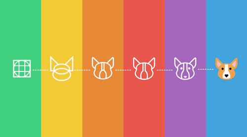
3. Icon design should be similar to each other

If you use several icons at the same time, they must be consistent with each other. Icons should create a style, not break it. In this example, we see three “drawn” images and one strict and concise. It is knocked out of the general row and violates the consistency of the interface.
4. Transparent background makes perception easier
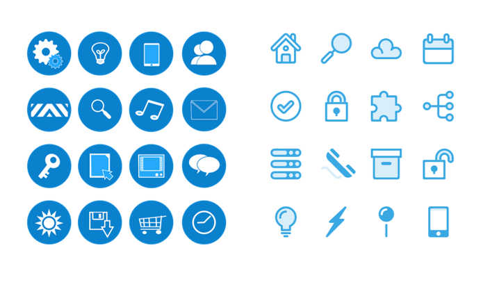
Using a transparent background increases the speed of perception. The colored background creates a visual noise that makes the icons appear the same. Compare:
When viewing icons with a blue background, instead of instantly understanding what is shown in the picture, you have to peer and distinguish the images. This is similar to reading a text, where you also have to strain your eyesight and understand the meaning. Therefore, the use of an opaque background facilitates visual perception and is easier for page visitors to interpret.
5. Use vector graphics if possible
The use of vector graphics in web design greatly simplifies the work of the designer - does not lose quality after resizing, you can easily change color and other parameters, as well as use animation effectively.